Optimizing Your Landing Page for Maximum Conversions

A non-marketing Internet user may define a landing page as any page of a website upon which a user might “land”. If that is the case, any page you find online is a landing page. That definition may not be entirely wrong, as there are also marketing practitioners who define a landing page in similar fashion.
When you’re a business owner, a marketing professional, a web developer, or an SEO expert, you become more specific. A landing page is a webpage that intends to capture the user’s information. In short, you create a landing page because you desire conversion.
You say, “If I want to convert visitors, all I have to do is create a page where they can write their email address or ZIP code in exchange for something.” Sounds simple enough, but it’s just not enough.
Creating a landing page that allows maximum conversion is not as easy as it sounds. What you should be careful to include in your plans is your landing page’s conversion optimization. A landing page that’s just sitting there, devoid of any attempt on your part to encourage as many conversions as possible, is a drain on your resources.
A landing page that’s just sitting there, devoid of any attempt on your part to encourage as many conversions as possible, is a drain on your resources.
Where do you start with your landing page optimization?
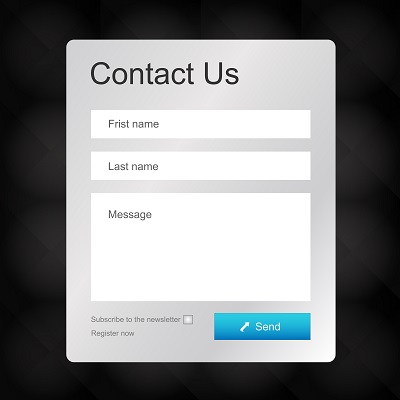
You can start by having a form that users can fill out with their information. This serves as your strongest opportunity to convert; you’re providing a superhighway in your conversion funnel, so to speak. You may ask for the user’s email address so you can start sending them freebies and offers. A good example of an offer-slash-freebie is giving the recipient a discount voucher for a webinar you’re hosting. Another use for the form is to get a user to subscribe to your blog.
Remember, when you ask for something from a user—in this case, their email address—you fulfill a purpose for yourself, so don’t forget to give your user something in return. Give them something of value; an eBook or a discount they can use in your store are good examples.
One more thing to remember when you’re thinking of including a form on your landing pages: user contact information is gold. It’s almost as if your users are giving you the key to their digital lives, if only to a certain limit. This is a huge step in your conversion optimization strategy.
What should your landing page look like?
This is a question that every list of conversion optimization tips should answer. Your landing page should never be confusing. It must be as direct to the point of your intent as possible. One button is sometimes all you need.
Your landing page should never be confusing.
The most important thing to remember is to keep your audience captive. Prevent bounces by limiting the number of opportunities for a user to leave your landing page. Otherwise, you are defeating the purpose of having that page at all.
When you perform your ecommerce conversion optimization, you’ll find that the space above the fold is more effective if it is uncluttered. Look at this old Basecamp page. The clutter makes it almost unpalatable for the audience.

Source: Kissmetrics

So they replaced the page with this less cluttered version. Immediately, you will notice the difference.
Source: Kissmetrics
Clutter makes your page less inviting, thus discouraging most users from staying long. People like a clean, easy-to-use page that’s understandable with one glance.
Clutter makes your page less inviting, thus discouraging most users from staying long.
As you can see with the changes in Basecamp’s website design, it’s perfectly fine to replace a landing page with something more useful and easier on the eyes. Do this for your landing pages if they’re not achieving your desired results.
Remember, a landing page is there to get users to give you, among other things, their contact details in exchange for something. So keep your focus on making that possible instead of the other way around. It’s always a trial-and-error kind of setup. Keep trying until you find the combination of factors that will help you achieve your conversion goals for your website.
